CJN Dakota County RMS
Building an RMS for the Criminal Justice Network.
TL;DR: A Breif Project Overview
The Criminal Justice Network (CJN) Records Management System (RMS) redesign began as a request for UI modernization, but research quickly revealed a deeper challenge. The system supported legally sensitive, high‑risk workflows across multiple roles, yet its structure did not align with how work actually happened in the field. Errors were costly, confidence was fragile, and usability issues were often mislabeled as training gaps.
As the lead UX Researcher, I guided the work from early discovery through strategic definition, ensuring research shaped what the team built—not just how designs were validated. The outcome was a roadmap grounded in real workflows, reduced operational risk, and a redesign that addressed systemic issues rather than surface‑level inconsistencies.
Role:
Lead UX Researcher (Discovery → Strategy → Design Enablement)
Impact:
Research influenced the product roadmap, reprioritized foundational workflows, reduced error risk, and ensured the redesign addressed systemic issues—not just UI inconsistencies.
Methodologies: Contextual Inquiry, Ride-alongs with patrol officers, Workflow walkthroughs with end users, Comparative system analysis, Surveys, Wireframes, Interactive Prototyping, Usability Testing
Background
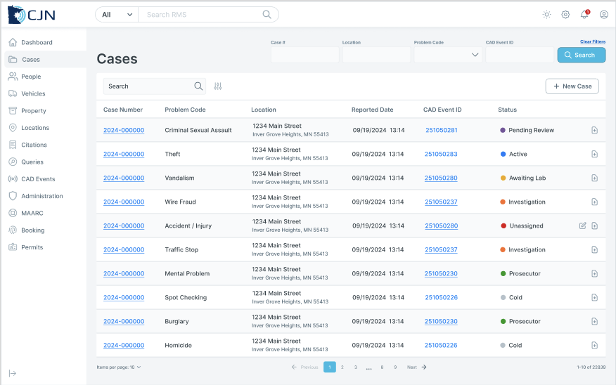
The CJN Records Management System sits at the center of law enforcement operations — the place where officers file reports after long shifts, evidence technicians maintain chain of custody, and records staff manage the documentation that holds cases together. Built to serve multiple agencies and roles simultaneously, the system had grown alongside its users' needs for years. But growth had come at a cost: layers of complexity that made a demanding job even harder.
The Problem
In environments where precision isn't optional, friction is more than an inconvenience. Officers navigating time-sensitive reporting workflows encountered forms that didn't match the way they actually thought about their work. Evidence technicians managing chain of custody had to locate critical information across a system that wasn't organized around their mental models. Records staff toggled between interconnected workflows with little guidance on sequencing or dependencies. The result was increased cognitive load, slower task completion, and — in a system where an error can have real downstream consequences — an elevated risk of mistakes.
The Solution
We started by getting close to the work itself: observing officers in the field, sitting side-by-side with evidence and records technicians, and running workshops across user groups to surface what wasn't working and why. From there, we conducted a systematic audit of the system's core workflows, forms, and navigation patterns — not just to catalog problems, but to understand where the design diverged from how people actually operated under pressure. The resulting changes simplified complex workflows, brought clarity to data entry, and restructured navigation around real user priorities — making it faster and safer to do the job right.
Early discovery reveals cracks in the system.
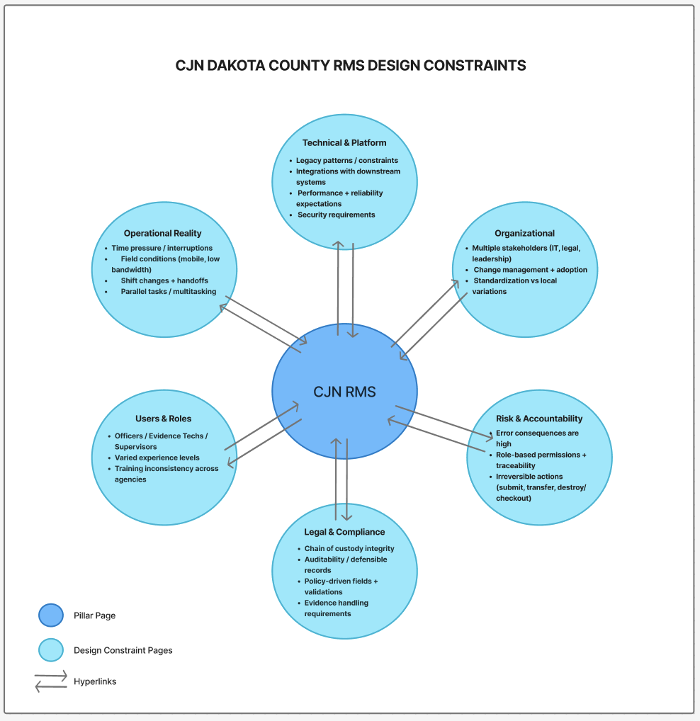
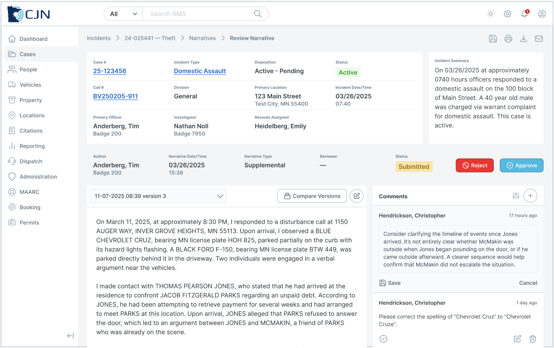
CJN RMS is used by officers, evidence technicians, and supervisors operating in high‑pressure environments where accuracy, accountability, and legal compliance are critical. The system supports evidence intake, chain of custody, reporting, and role‑based handoffs—work that leaves little room for error.
Several constraints defined this project:
Errors carried legal and operational consequences
Users worked under time pressure and cognitive load
Institutional knowledge compensated for design gaps
Newer or less‑resourced users were disproportionately impacted
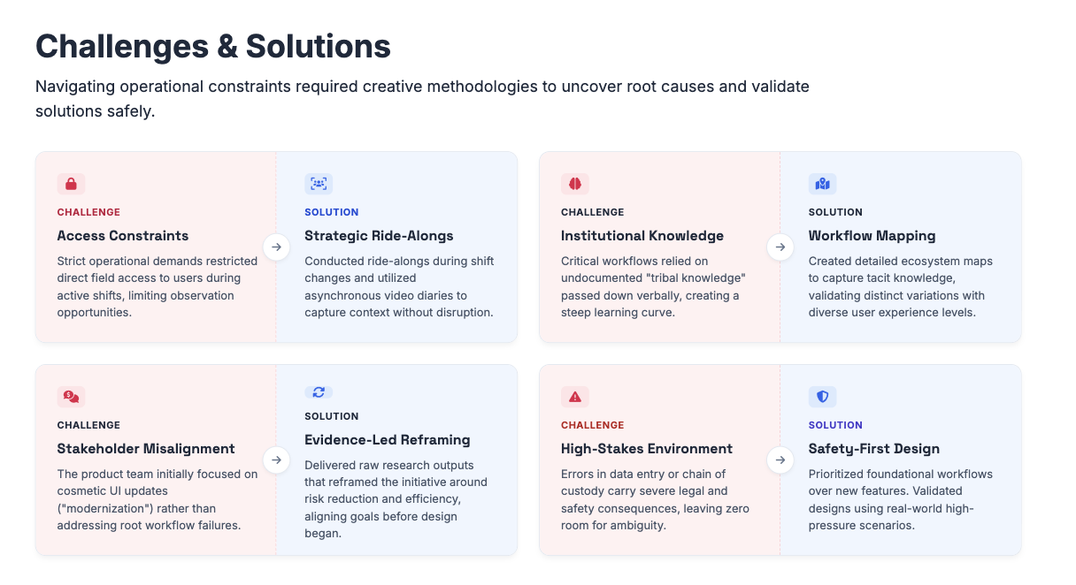
Although the project was framed as a redesign, there was no shared understanding of the root problem. This created an opportunity for research to reframe the work before solutions were defined.
We needed to understand not just what users were doing, but how and why they were doing it — and where the system itself actively undermined their workflow.
Strategic Research Question
Rather than validating an assumed solution, I reframed the effort around a core discovery question:
How might we redesign the RMS so it reflects real‑world workflows, reduces legal and operational risk, and supports users with varying levels of experience—before defining a solution?
This reframing shifted the focus from UI improvements to understanding systemic breakdowns, risk points, and unmet needs across roles.Research Approach & Methods
Discovery First
There was no shared clarity on whether issues stemmed from usability, policy, workflow fragmentation, or system logic. Beginning with discovery allowed us to understand root causes before committing to a design direction.
Methods Used
I led a mixed‑methods discovery effort that prioritized depth while adding lightweight quantitative signals for confidence and prioritization:
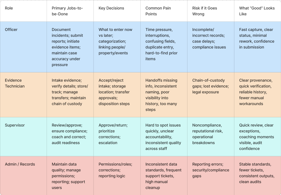
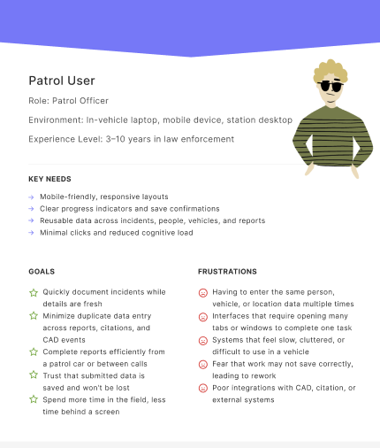
Contextual interviews and workflow walkthroughs across roles
conducted ride-alongs with patrol officers to observe workflows in the environments where they actually happen — in patrol cars, under time pressure, with mobile constraints. We also conducted in-context walkthroughs with records staff, investigators, and evidence technicians.
This grounded approach uncovered what users struggle with in their environment, not just in theory.
Role‑based task analysis
Journey and handoff mapping
Qualitative research supported by lightweight quantitative checks (frequency, segmentation by experience level)
Bias Reduction in Practice
Bias reduction was intentionally designed into the research:
Sampling across roles and experience levels, not just power users
Avoiding “user error” framing during synthesis
Segmenting insights to understand who was most impacted
Peer review and collaborative synthesis to reduce researcher bias
Goals:
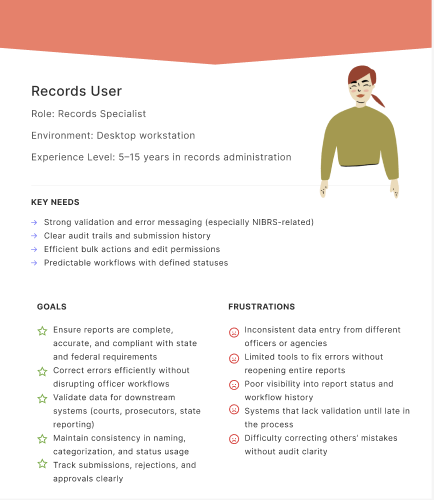
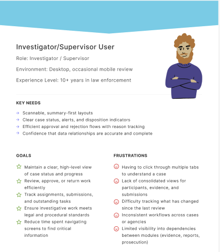
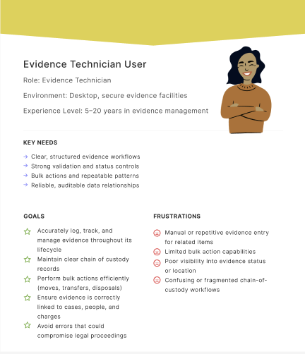
Understand real-world workflows across diverse roles in context
Identify the core user types and role specific user needs
Uncover unmet needs, workarounds, and trust issues with current systems
Translate research insights into concept directions
Validate design decisions with users through iterative testing
Strategic Research Outputs
Instead of jumping to UI recommendations, research outputs were intentionally solution‑agnostic to inform decision‑making:
Opportunity areas tied to risk and workflow breakdowns
Workflow and handoff maps highlighting failure points
Experience principles grounded in real constraints
Equity and risk flags surfaced early
Explicit assumptions and open questions
These artifacts helped align product, design, and engineering before any screens were designed.
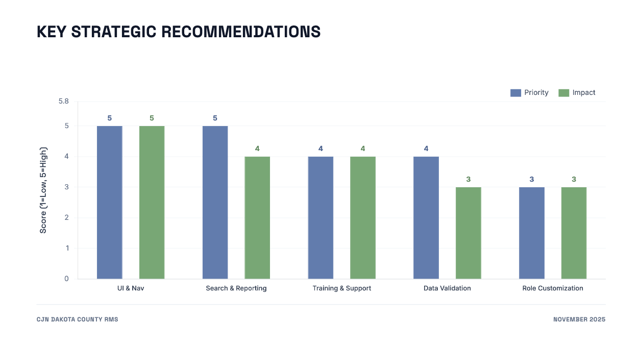
Roadmap Influence & Decision Impact
Research directly shaped the product roadmap by:
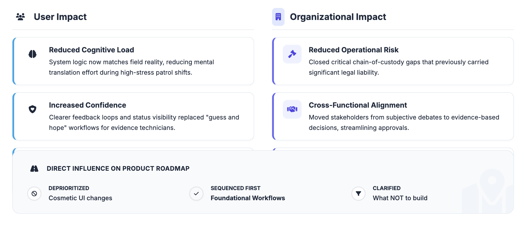
Deprioritizing cosmetic UI changes
Re‑sequencing work to stabilize foundational workflows first
Clarifying what not to build
Aligning teams around shared success criteria
By grounding decisions in evidence, the team moved forward with clarity and confidence rather than debate.
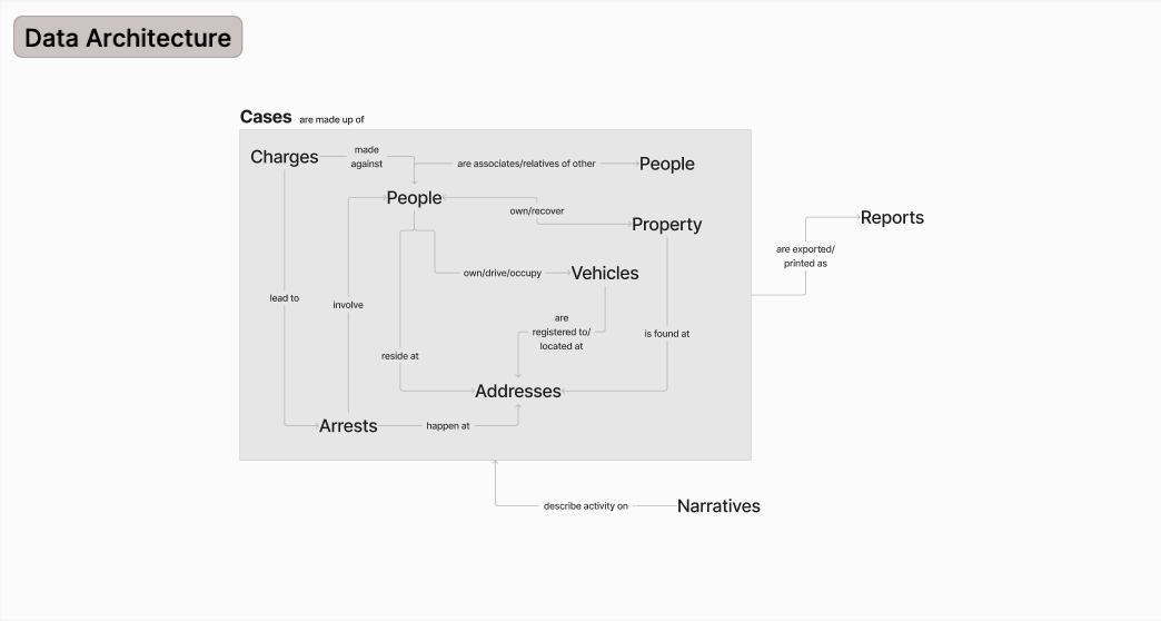
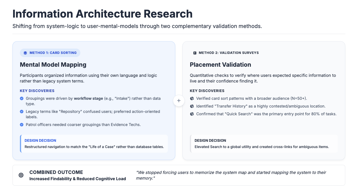
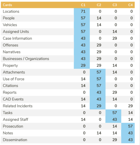
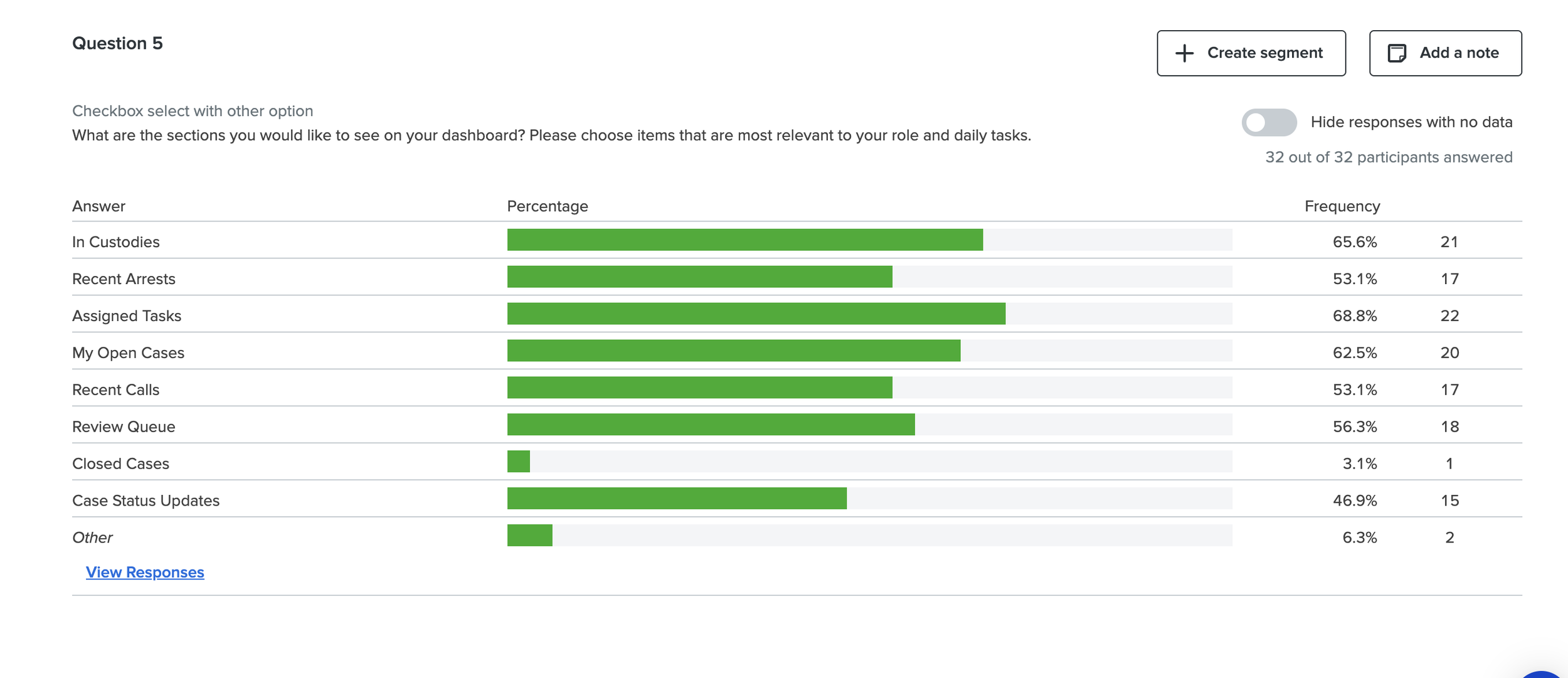
Information Architecture Research: Card Sorting & Surveys
To ensure the redesigned RMS aligned with how users naturally organize and retrieve information, I led a set of information architecture (IA) research activities focused on mental models rather than existing system structure. This work helped us avoid simply re‑creating legacy patterns in a new interface.
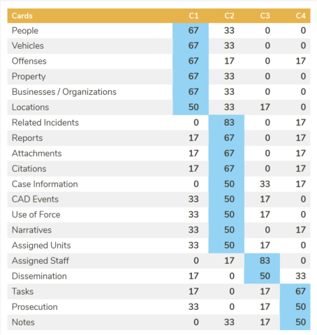
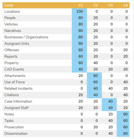
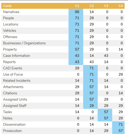
Card Sorting: Understanding Mental Models
We conducted card sorting activities with users across roles and experience levels to understand how they grouped concepts, tasks, and data elements. Rather than testing an existing navigation, participants were asked to organize information in a way that made sense to them, using their own language and logic.
This activity revealed clear patterns in how users conceptualized work:
Groupings were driven by workflow stage rather than data type
Certain terms used in the legacy system did not match user language
Role and experience level influenced how granular groupings needed to be
The results helped us identify where the existing IA conflicted with user expectations and where shared mental models existed across roles.
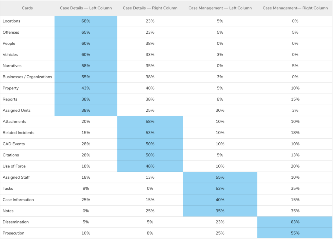
Surveys: Validating Placement at Scale
To complement the qualitative findings from card sorting, we conducted targeted surveys to validate where users expected specific information to live and how confident they felt finding it. These surveys provided lightweight quantitative signals that helped prioritize IA decisions and resolve areas of disagreement.
Survey data allowed us to:
Validate card sort patterns with a broader audience
Identify ambiguous or contested content areas
Understand confidence and findability, not just preference
Design Exploration
Insights from card sorting and surveys directly informed:
Navigation structure and grouping logic
Labeling and terminology choices
Placement of high‑frequency and high‑risk information
Reduction of reliance on institutional knowledge to locate critical data
By grounding the IA in user mental models and validating decisions at scale, we increased findability, reduced cognitive load, and supported more consistent use across roles.
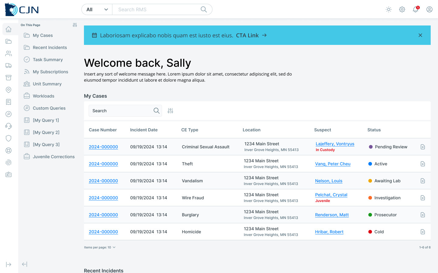
Concept 1 — Tabbed Interface
A traditional multi-tab layout designed to segment information by module (evidence, people, case notes). This mirrored familiar enterprise patterns and aimed to reduce visible page clutter.
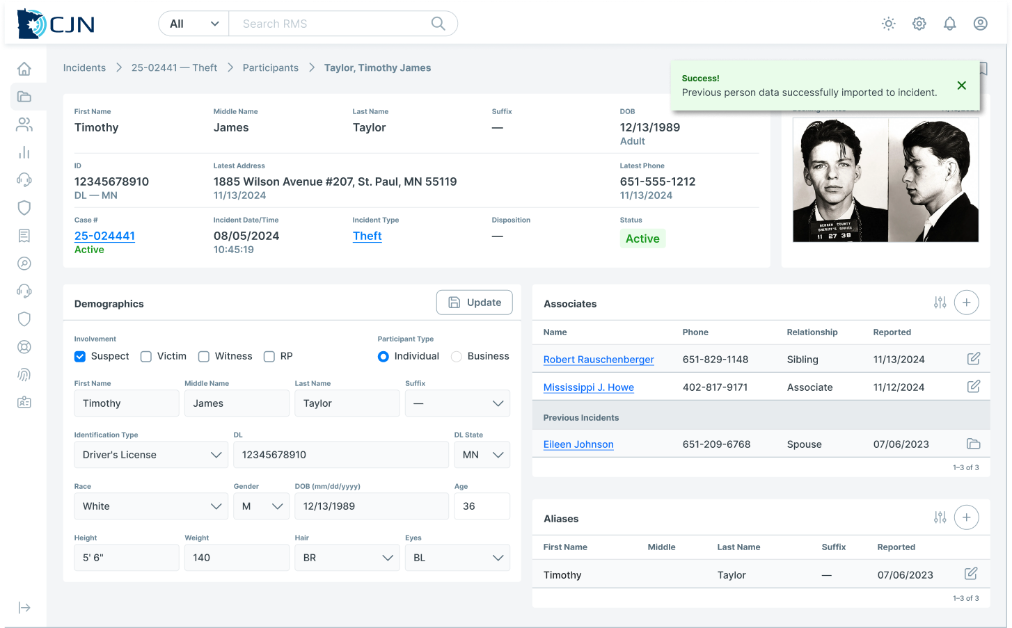
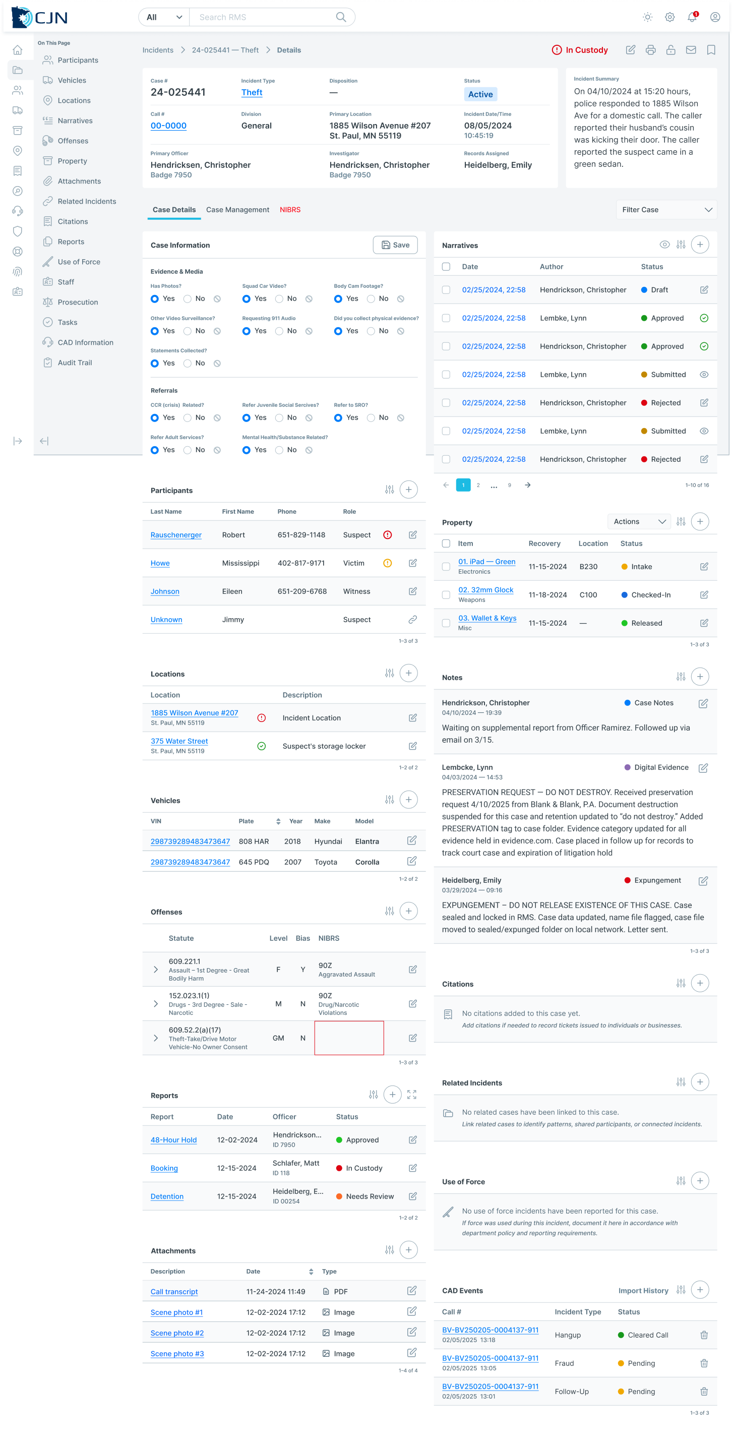
Concept 2 — Single-Scroll Page
This concept consolidated all relevant case information on a single, vertical flow — reducing context switching and enabling users to see relationships between people, incidents, and evidence without opening multiple windows or tabs.
User Choice:
After internal reviews and stakeholder discussions, users consistently preferred the single-scroll approach. It aligned with their needs for continuity, fewer clicks, and less mental overhead.
Iterative Validation
Co-Design Workshops
We engaged cross-agency representatives in workshops to:
Refine feature sets (evidence handling, unknown suspect management)
Validate workflow logic
Clarify domain terminology
Workshops ensured the design accounted for:
Role differences (patrol vs evidence vs records)
Edge cases (e.g., multi-jurisdiction incidents)
Legal and compliance constraints
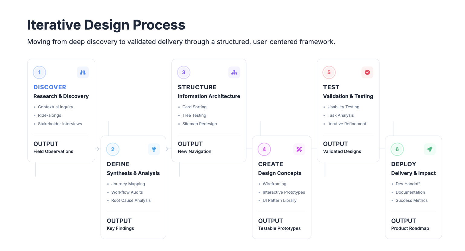
Usability Validation
We separated validation into two distinct phases to ensure the design was not just usable in isolation, but resilient in complex operational contexts.
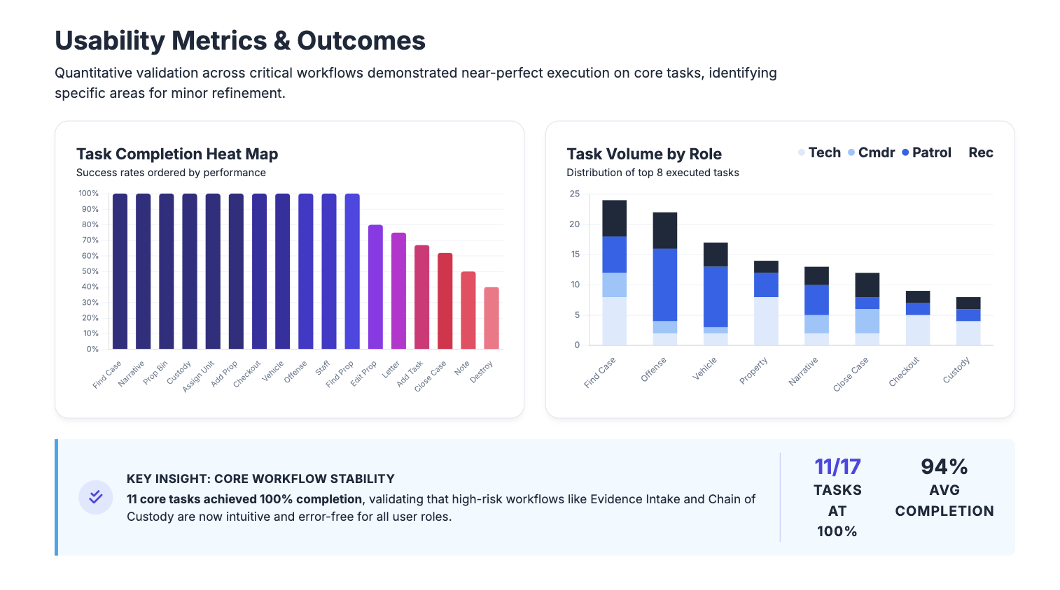
Round 1: Task Validation
The first round focused on task-based usability testing to ensure critical actions could be completed accurately, efficiently, and with confidence. Sessions were moderated and scenario-based, centered on high-risk tasks such as evidence intake, updates, transfers, and status changes.
This study focused on:
Content hierarchy
Navigation logic
Task success rates (e.g., create/edit evidence, link people to cases)
Reduced friction across workflows
Participants were asked to complete representative tasks while thinking aloud, allowing us to observe comprehension, decision points, and error recovery. Success criteria included task completion, clarity of system feedback, and alignment with user expectations.
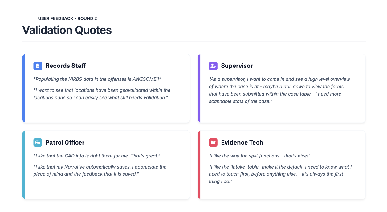
Round 2: Workflow Analysis
The second round shifted from isolated tasks to holistic workflow analysis. Rather than asking users to complete individual actions, participants walked through realistic, multi-step scenarios that mirrored how work unfolds across roles and over time.
This study focused on:
Handoffs between roles
Visibility of ownership and status
Cognitive load across steps
Points where users paused, double-checked, or relied on workarounds
By observing workflows end to end, we validated that improvements made at the task level held up when compounded across a full case lifecycle. This round also revealed whether the redesign truly reduced reliance on institutional knowledge and supported newer or less-experienced users.
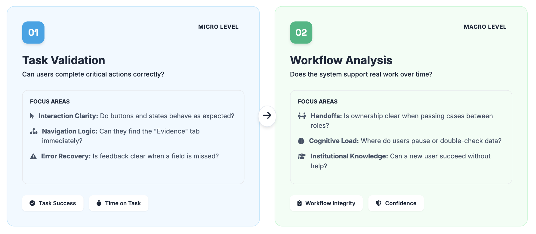
Why Two Rounds Mattered
Separating task validation from workflow analysis allowed us to answer two different questions:
Can users complete critical actions correctly?
Does the system support how work actually happens over time and across roles?
Together, these studies ensured the redesign was not only usable in isolation, but resilient in real operational contexts.
Outcomes & Impact
User Impact
Reduced cognitive load in critical workflows
Increased confidence across user roles
Improved support for newer and less‑resourced users
Business & Organizational Impact
Reduced operational and legal risk
Stronger cross‑functional alignment
Elevated trust in research as a strategic partner
Reflection
This project was especially meaningful to me because it reinforced why I’m drawn to complex, high‑stakes systems and discovery‑led research. Working so closely with officers, evidence technicians, and supervisors made it clear how much invisible effort people carry when systems don’t fully support their work. Seeing users rely on workarounds and institutional knowledge — often under real pressure — gave me a deep sense of responsibility to get the research right.
One of the most valuable lessons from this work was the importance of slowing down early to listen, even when there is pressure to move quickly into design. Creating space for discovery not only led to better decisions, but also built trust with stakeholders and users who felt genuinely heard.
If I were to continue this work, I would focus on deepening it rather than broadening it:
Establishing longitudinal research to understand how workflows evolve over time
Defining clearer metrics tied to confidence, error reduction, and risk mitigation
Maintaining an ongoing feedback loop with users across departments to ensure the system continues to reflect real‑world needs
Overall, this project strengthened my belief that good research isn’t just about producing insights — it’s about honoring the people behind the workflows and helping teams build systems they can rely on.