Provider Search Usability Study
ucare.org
My Role
I planned and led a moderated usability study to evaluate UCare’s Provider Search portal. I owned the research end-to-end: eligibility survey design, study planning, session moderation, synthesis, and translating insights into actionable recommendations for design and product teams. 2025 Usability Report
The Problem
UCare members rely on the Provider Search tool to find in-network doctors, clinics, and pharmacies—often during stressful or time-sensitive moments. While usage data showed steady adoption, we lacked qualitative insight into:
Whether the experience felt intuitive and trustworthy
How members actually searched for providers and services
Where confusion occurred around filters, search accuracy, and network status
My goal was to validate what was working, uncover usability gaps, and identify clear opportunities for improvement grounded in real member behavior.Overview
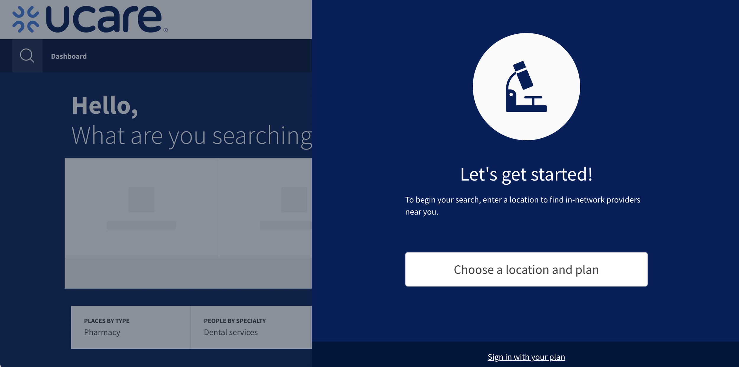
UCare’s Provider Search portal helps members find in-network doctors, clinics, and pharmacies based on their health plan. This usability study evaluated whether members could successfully find providers, understand the information presented, and trust the results they were seeing.
The study focused on real member needs: finding providers quickly, understanding network status, and making confident healthcare decisions. Findings from this research informed prioritization for future design and search improvements.
Research Goals
Understand how members naturally navigate the Provider Search experience
Evaluate ease of use across key tasks (provider, specialty, location, pharmacy)
Assess clarity, trust, and quality of information provided
Identify gaps, confusion points, and opportunities for improvement
Methodology
The study used a two-phase research approach:
Eligibility Survey
Members completed a short survey to confirm plan eligibility and demographic diversity.Moderated Usability Testing
One-hour, one-on-one video sessions
Think-aloud protocol
Participants searched for:
A specific physician
A specialty provider
A clinic by name
A pharmacy
Follow-up questions explored trust, clarity, and missing information
Participants
5 current UCare members
Ages 47–70
Desktop and mobile users
Moderate to advanced comfort with technology
Key Metrics at a Glance
100% task completion rate across all core tasks
100% of users located the Provider Search tool successfully
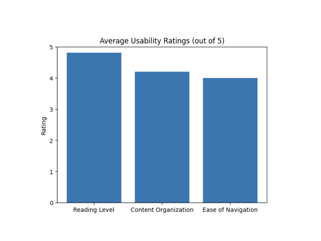
Average usability ratings exceeded goals:
Reading level: 4.8 / 5
Content organization: 4.2 / 5
Ease of navigation: 4.0 / 5
0 users preferred replacing tiles with a single search bar
What I Learned
What Worked Well
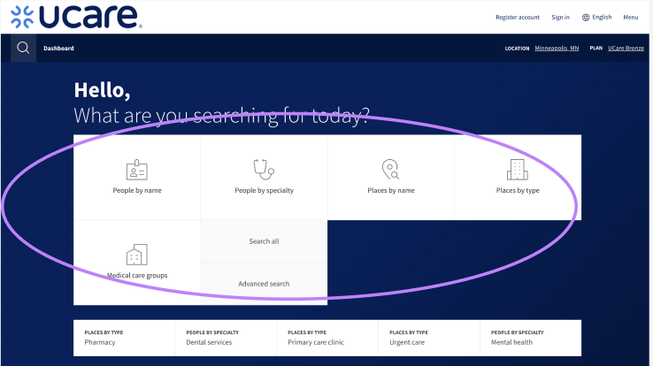
Guided tiles build confidence
All participants used the dashboard tiles successfully. Users consistently said the tiles helped them understand where to start and reduced cognitive load.
“The dashboard makes it easy. It narrows it down for me.”
Location drives decision-making
Location was the #1 factor users relied on when choosing providers or pharmacies. Participants consistently searched for the closest option first.
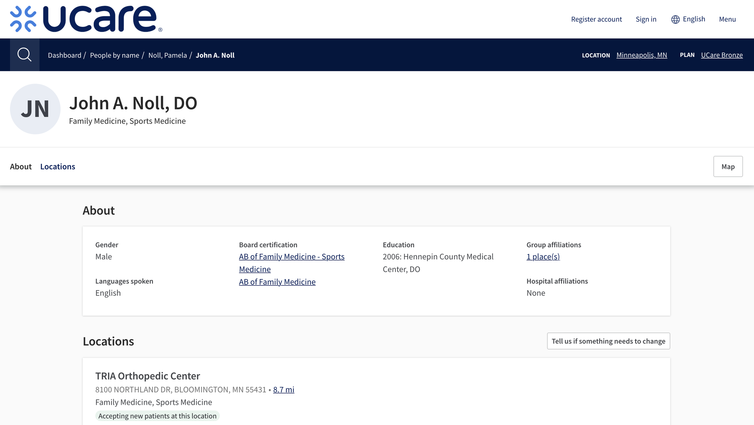
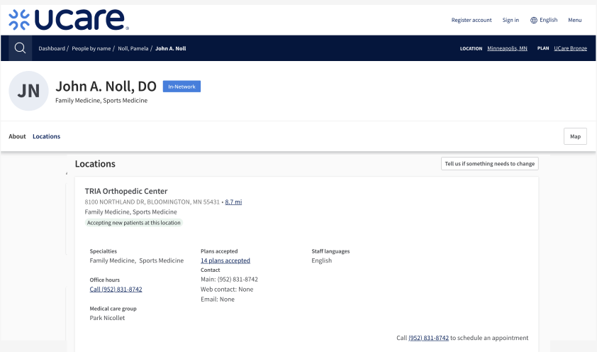
Provider profiles met expectations
Once users reached profile pages, they felt the information was familiar and useful—especially name, location, specialty, and contact details.
Where Users Struggled
Filters reduced trust
3 of 5 users did not notice filters without prompting
Filters sometimes expanded results instead of narrowing them
Split filter placement caused confusion
This behavior led users to question whether filters were working correctly.
Search lacked specificity
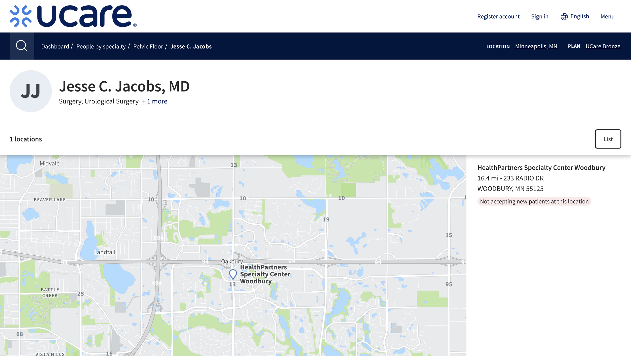
Users could find broad specialties, but failed to find subspecialties like:
Pelvic floor therapy
Hand surgery
Physical therapy (returned incorrect results)
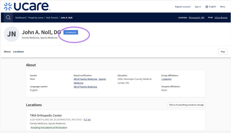
Network status wasn’t obvious
Despite results being in-network by default:
Multiple users actively looked for confirmation
Users wanted a clear visual or text indicator

Outcomes & Recommendations
Based on synthesis across sessions, I delivered the following prioritized recommendations:
Preserve and strengthen guided tiles
Tiles should remain a primary entry point—they increased confidence and task success.Redesign filters for clarity and trust
Group all filters in one location
Ensure filters consistently narrow results
Improve discoverability and labeling
Improve search accuracy
Enhance provider tagging
Support subspecialties and synonyms
Improve keyword flexibility
Clarify in-network status
Add visible indicators confirming providers are in-network
Elevate the “Accepting new patients” filter
Improve information hierarchy
Surface key details (location, hours, accepting new patients) directly in search results
Allow progressive disclosure for deeper profile details
Impact
This study validated that the Provider Search experience successfully supports core tasks, while also uncovering specific usability gaps that directly informed roadmap prioritization. The insights helped align design, product, and stakeholder teams around what to preserve, what to fix, and what to build next—grounded in real member behavior rather than assumptions.
Why This Work Matters
Finding healthcare is a high-stakes experience. By observing real members in real scenarios, I helped ensure UCare’s Provider Search tool is not only usable—but trustworthy, clear, and supportive when members need it most.